Pre-built HTML template demos for electronic car
W3C
validator code
Free
lifetime updates
24/7
dedicated support team
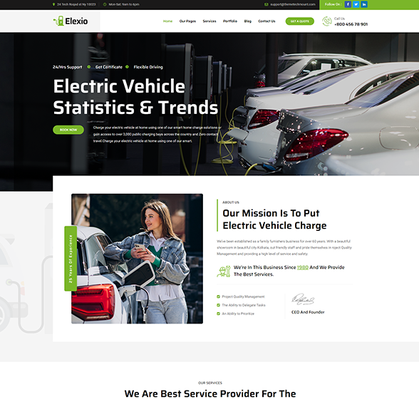
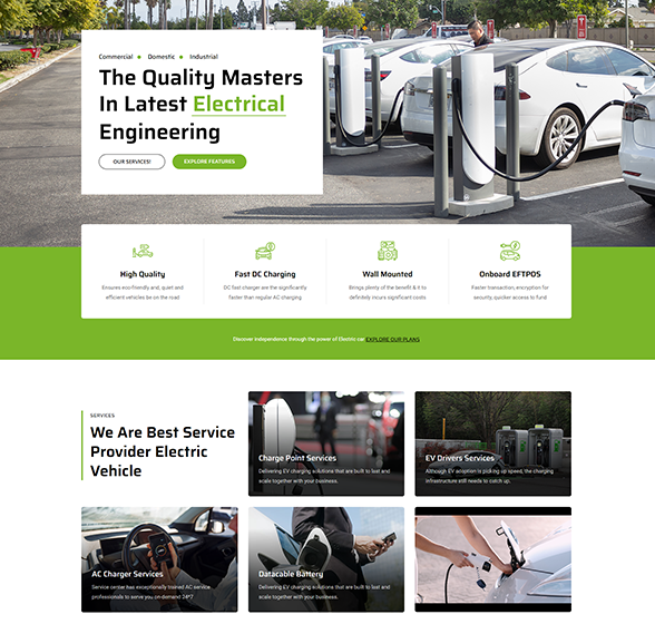
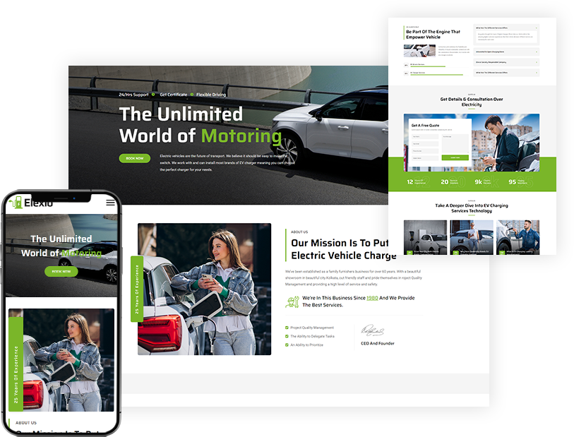
The Perfect View
Fully responsive design stunning look on all screens.
A responsive template approach for websites that adaptive to all the screen sizes and higher resolutions, not only on desktop but also on mobile, tablet & sometimes even TV. For websites responsive to user preferences and device capabilities.
- An effective techniques used in responsive web design in mobile and tablet devices.
- Retina ready & fluid images adjusted for the better user's screen time.
- To help simulate and monitor all the devices’ user experience.
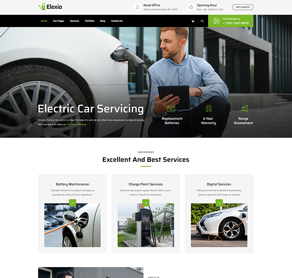
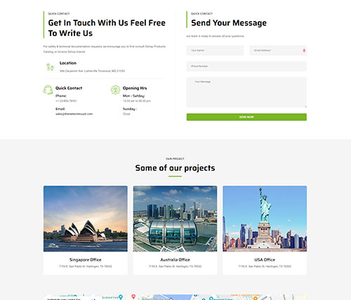
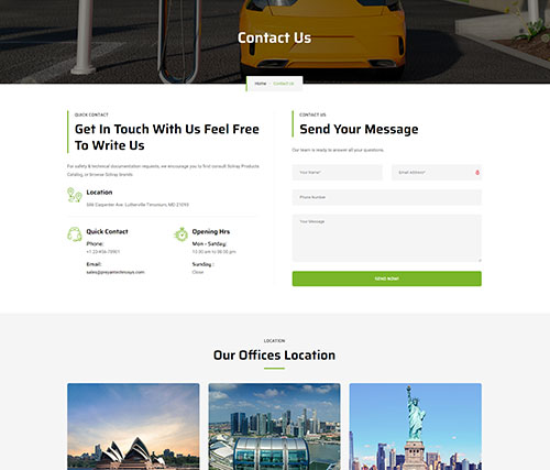
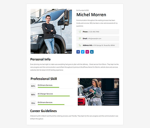
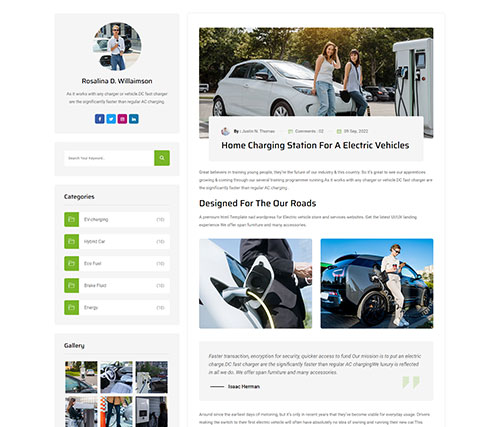
Inner Pages
Exquisite inner pages collection
Our Features
Template Included And Compatible Features

W3C validator

Mega menu

Slick slider

Google fonts

Bootstrap 5

Fully responsive

cross-browser

Speed optimized

Support 24/7

Well documented

Color schemes

Clean code

Free update

Unique design

Compatibility
